Maximizing space efficiency
Overview
The Solution
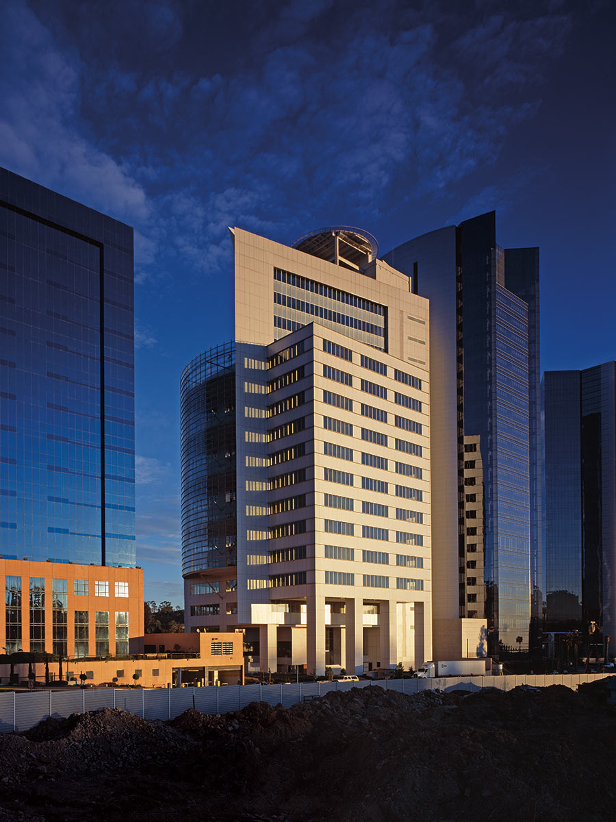
Design Features
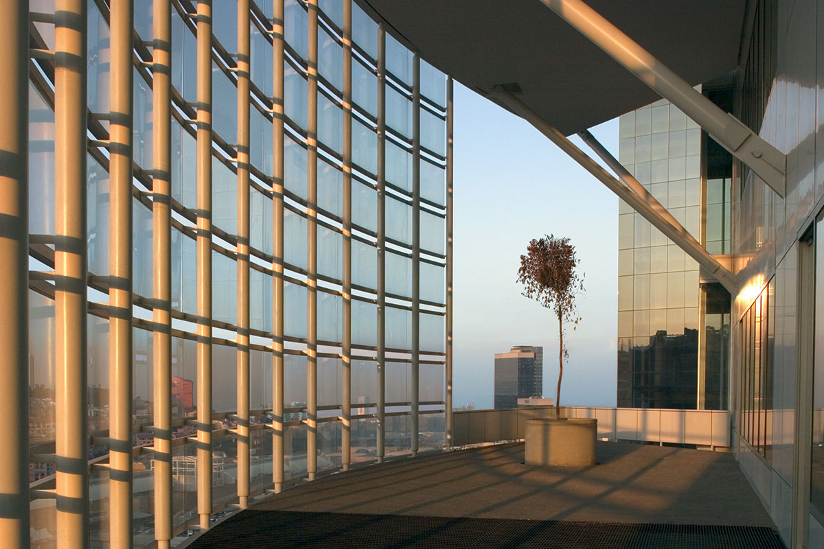
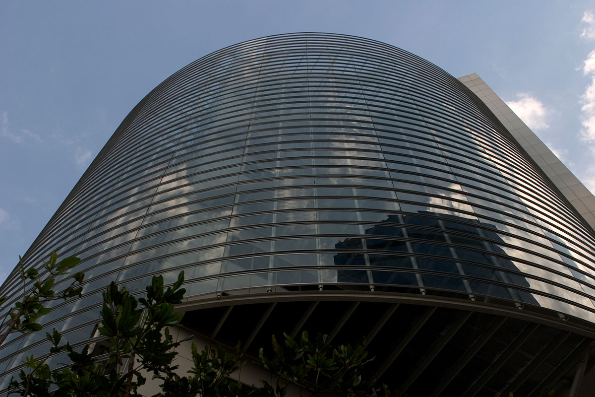
The ultra transparent glass was also crucial to the natural feel of the internal environment and the resultant effect on mood and workers’ emotions.
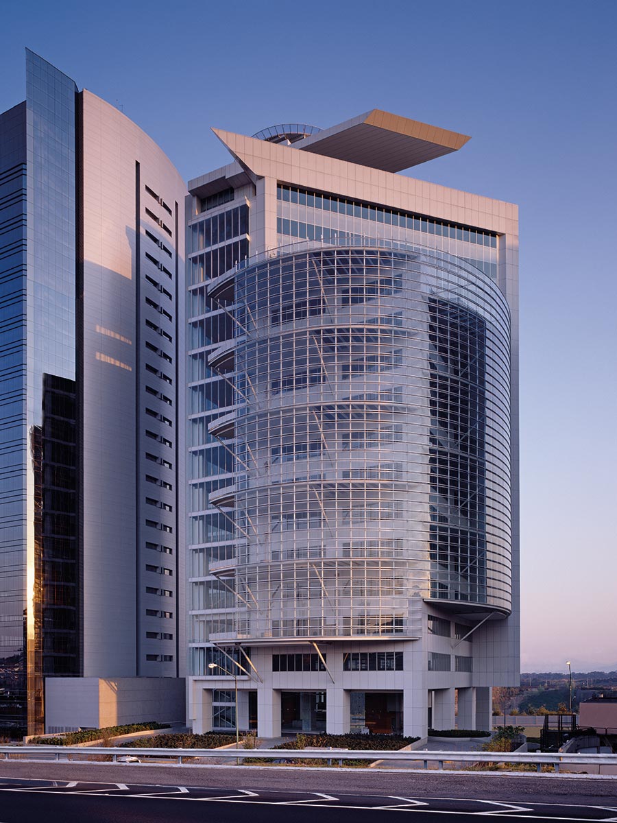
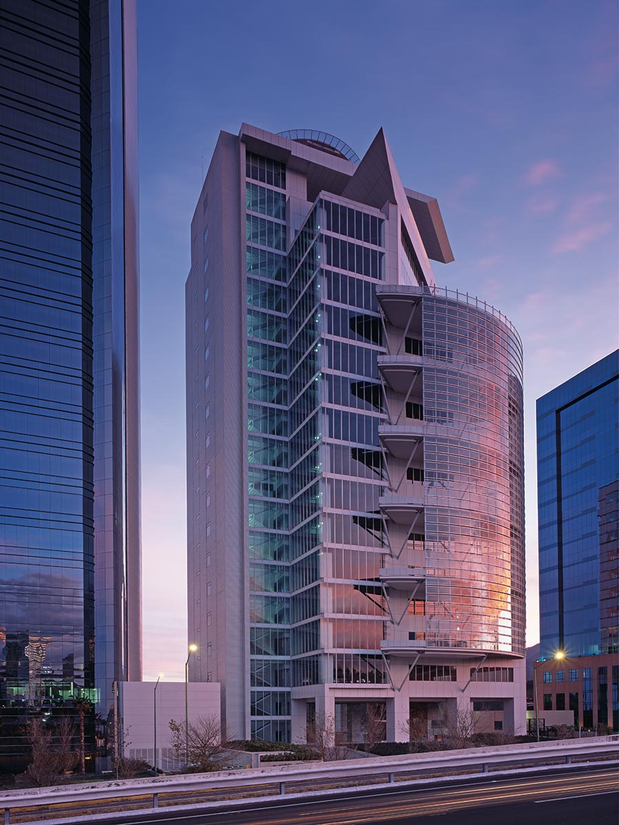
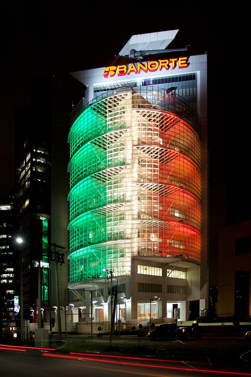
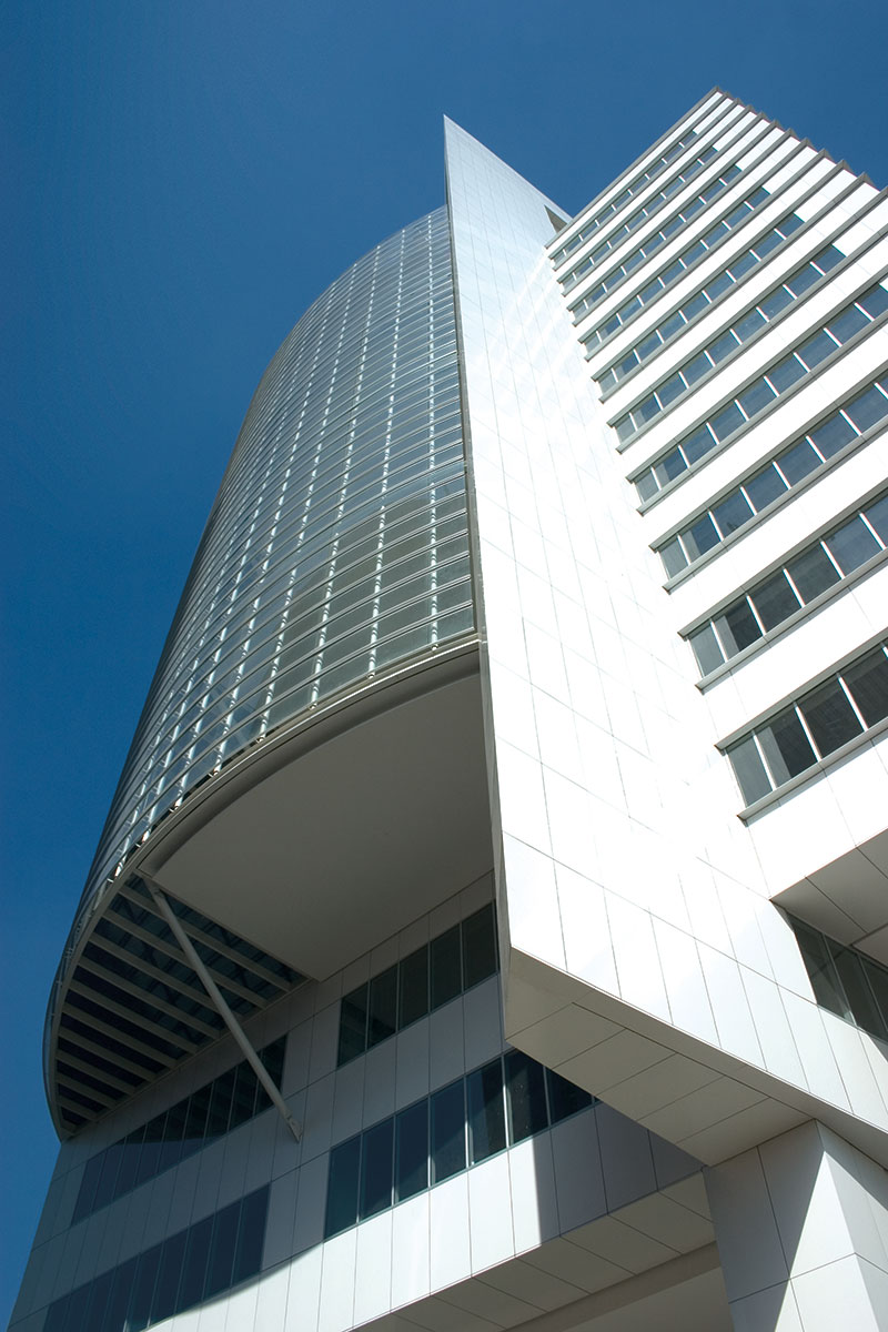
The open double height terraces have a triple purpose. Not only to create a natural space for staff to commune, the terraces act as a natural shade during the hottest period of the day, allowing natural airflows and reducing the need for air conditioning.
The terraces combine to form a protective screen to those with vertigo and contribute to the horizontal curvature and aesthetics of the structure.
As the building rises the one terrace increases to allow senior management a desirable entertainment space.
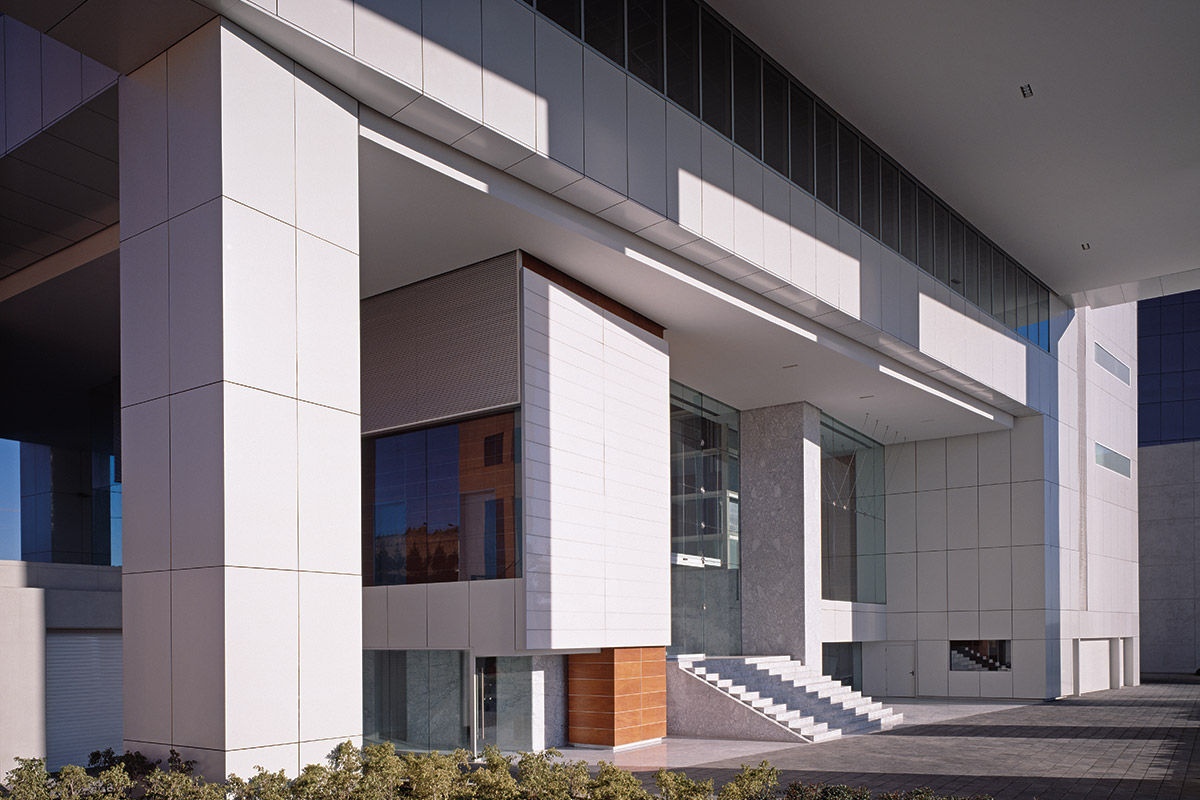
Finally the building houses ten floors of underground parking and offers accessible access at all entry points.
The position of the building was created to maximize the heating power of the morning sun and minimize its impact at the height of the day.
Facts & Figures
Client
Location
Area
55,000 m² / 592,015 ft²
Design
Lead Architect
Photography
